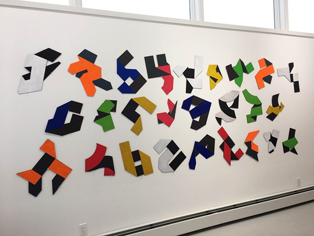
Shape and pattern have been the focus of my work for thirty some years. We respond to both on the most primal level: Shape clarifies and defines; pattern organizes and makes prediction possible. Early on I employed geometric shapes and patterns informed by music and dance or derived from chance and other mathematical concepts. But more recently the alphabet has been my inspiration. As an avid reader since childhood, a freelance copy editor in the publishing industry, and a crossword puzzle addict, letters, words, and typography have been an important part of my life. But it wasn't until a few years ago that I started to see them in a new and different light: Words are patterns composed of letters, and letters represent myriad remarkable shapes. Those shapes are interesting in and of themselves, but when you manipulate them--in the case of my work by folding--and introduce two-tone color, they become unrecognizable as the straightforward, monochromatic elements they are on the printed page, purveyors of narrative, something familiar with which we feel safe, and instead turn into something else altogether. The narrative is still there but it has to be "read" differently. Whether dancing across a wall or in conversation on a tabletop, what emerges is a lively interaction of shape, pattern, and color that engages not only the eye but also both sides of the brain simultaneously.